mPower
Understanding your Parkinson's Disease and telling your unique story.
Product Design
Branding
Design System Creation
User Research
About
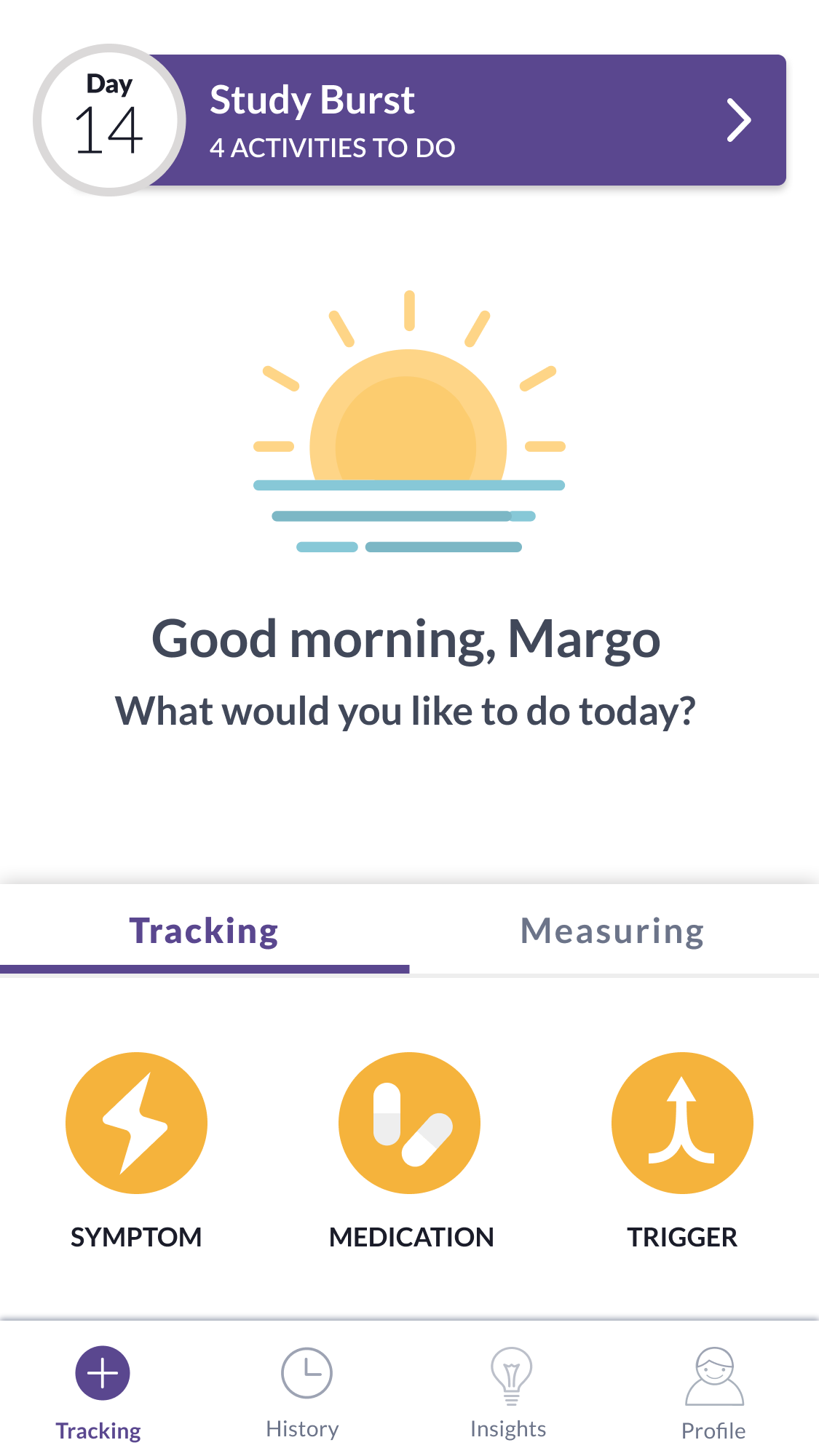
Tracking medication and other factors (e.g. stress, exercise) to provide insight into symptoms and ability to complete activities. Helping to provide insights into day to day health and lifestyle. Developed Sage Bionetwork’s Mobile Health Platform which has supported over 500k research participants.
The Problem
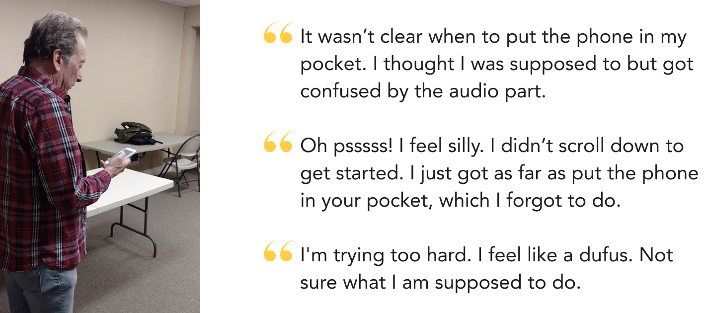
Users were facing confusion and frustration with the existing mPower interface, leading to a drop-off in engagement.
Research
The user research phase concluded, it revealed that users experienced confusion and frustration with the current mPower interface, resulting in a decline in engagement. The significance of mPower to researchers depends on users' authentic interest and their ability to actively participate. User research also uncovered some key findings that would make mPower's users more engaged, and find the application more valuable in their daily lives.
The Findings
Understand their condition
Users wanted to learn more about what effects their symptoms, monitor their long-term progression, and understand how long their treatment effects last.
Share with clinician
Users had to catch their clinician up on weeks or more of their condition. It was important that they were able to share their progress quickly and easily with their care team.
Better overall experience
Users were frustrated and confused with the current version of mPower. In order to continue using the app it was crucial that we made it easier to use and more engaging.
Design
Once we understood where users were having difficulties and what could be improved, we went to the drawing board. We incorporated the users' desire for a better understanding of how their medication affects their condition, enhanced users' comprehension of their condition's progression, reinvented the consent process, developed a digital health design system, updated digital health assessments to make them more usable and eliminate user errors and more.
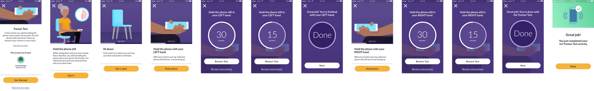
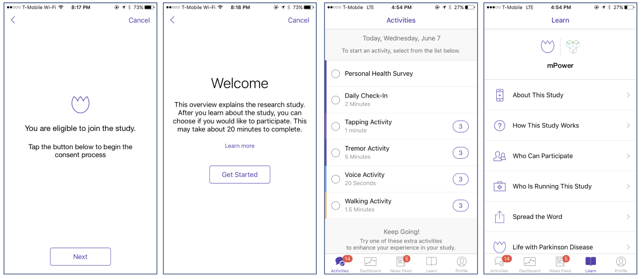
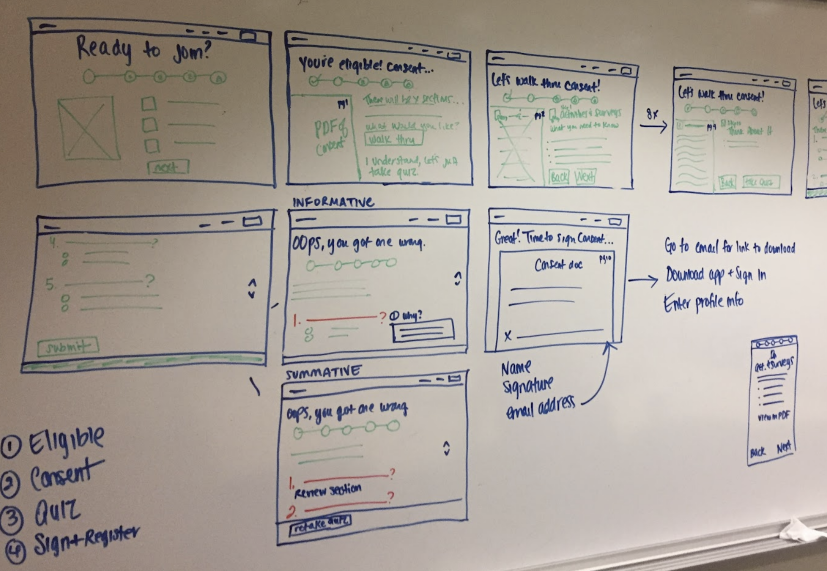
The Consent Process
Users would complete a multitude of steps and download the app, only to find out that they were not eligible for the study becoming frustrated and disheartened. We addressed this problem by reimagining the entire consent flow and creating a website to allow for background before downloading the app and registering for the study.
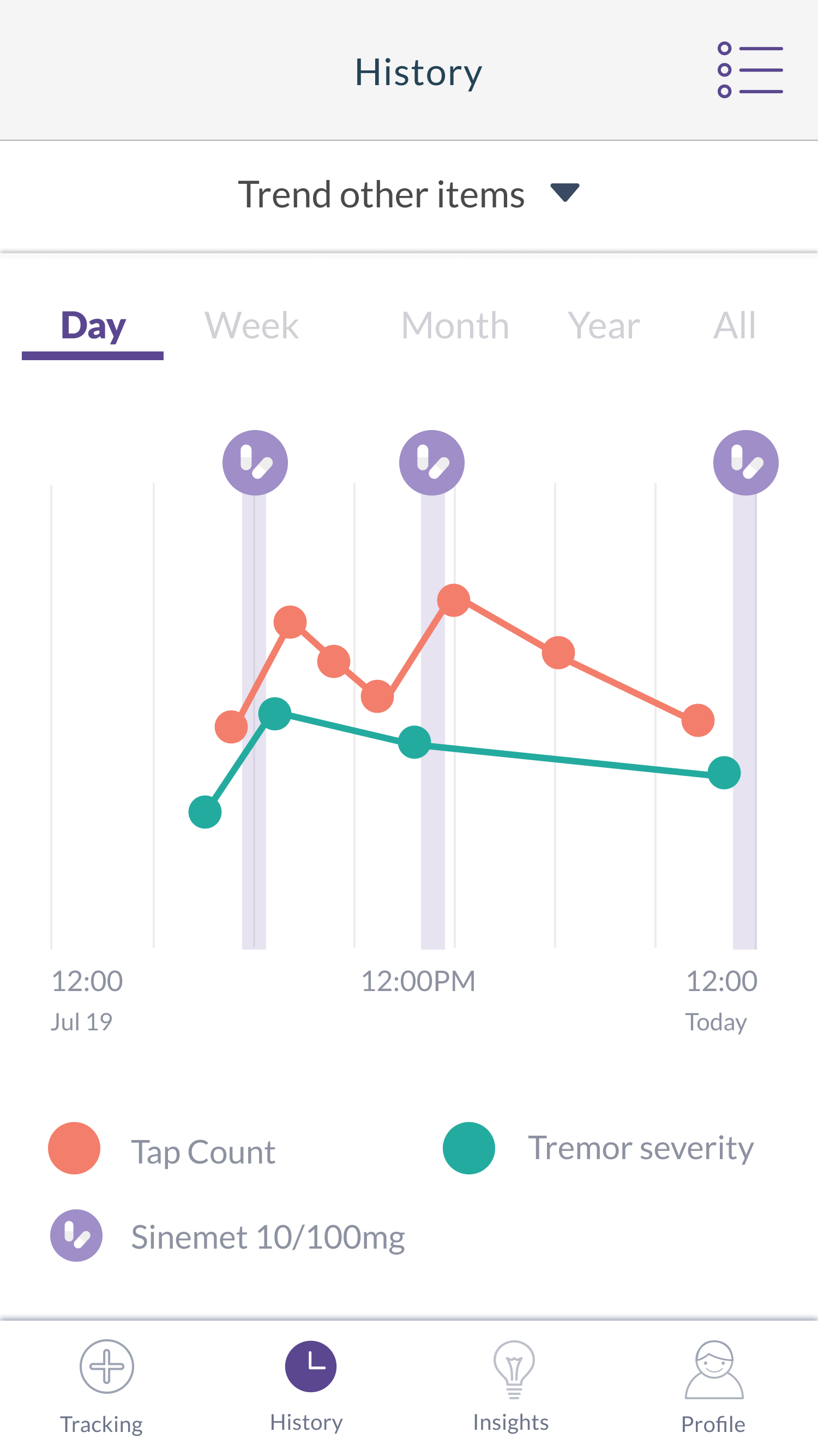
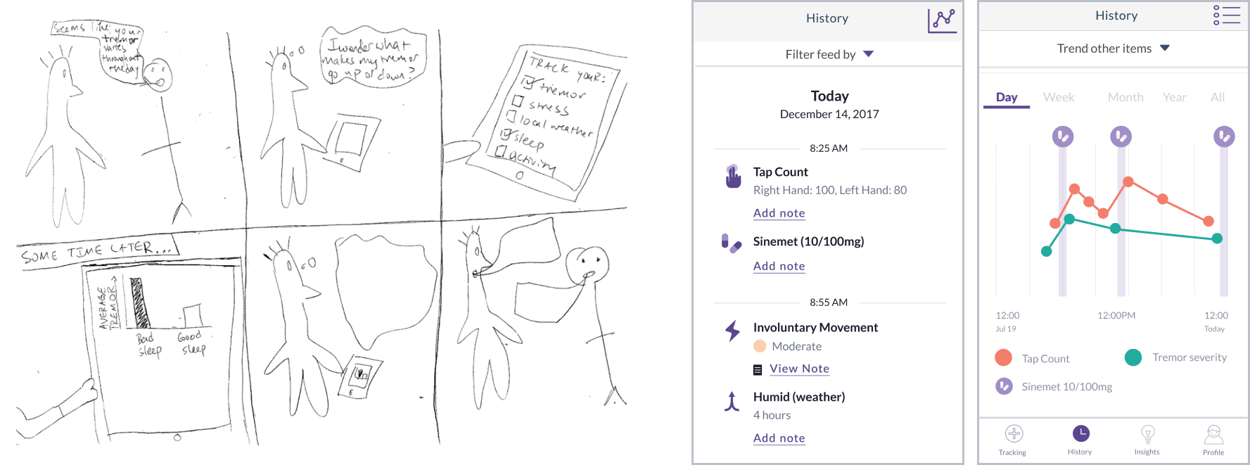
Helping users understand how their condition is effected by medications, symptoms and triggers.
Incorporated the tracking of symptoms, medications and triggers to understand how their condition was being effected. History view allowed users to view how their assessments were being effected by these tracked items over their selected period of time.
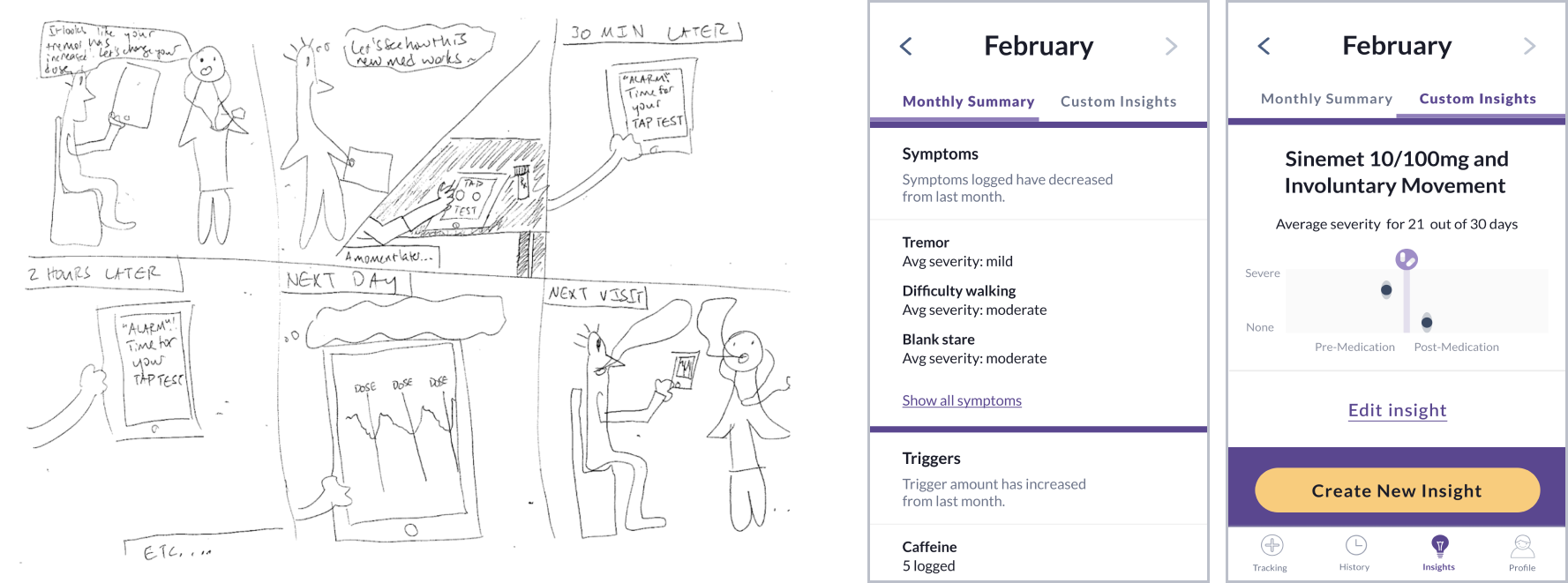
Comprehension of their condition's progression.
Insights allowed users to receive a summary for their month as well as custom insights based on their engagement. Since users may have a great deal of time between clinic visits, summaries were made to help clinicans understand the users condition progression, and associated triggers and symptoms.
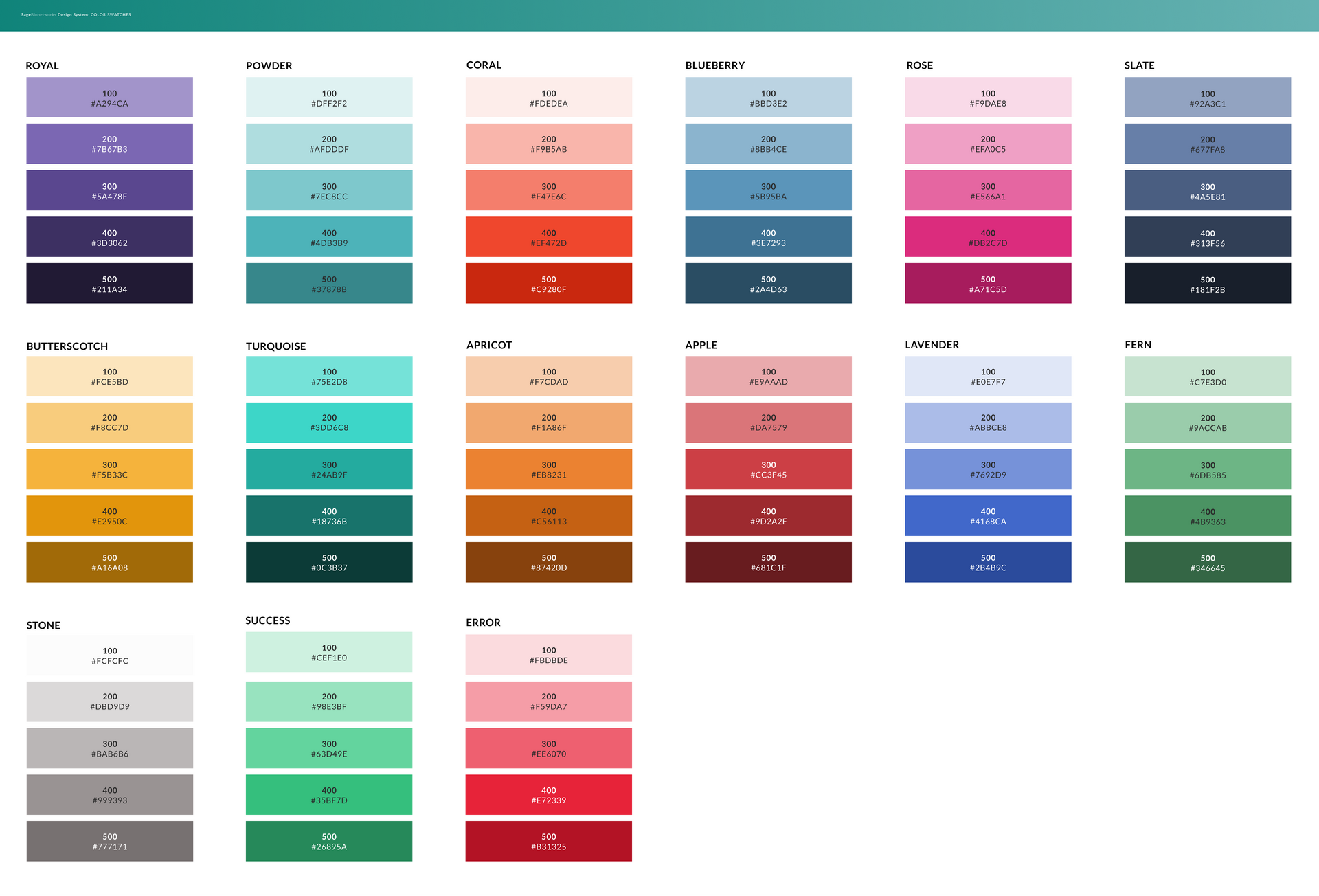
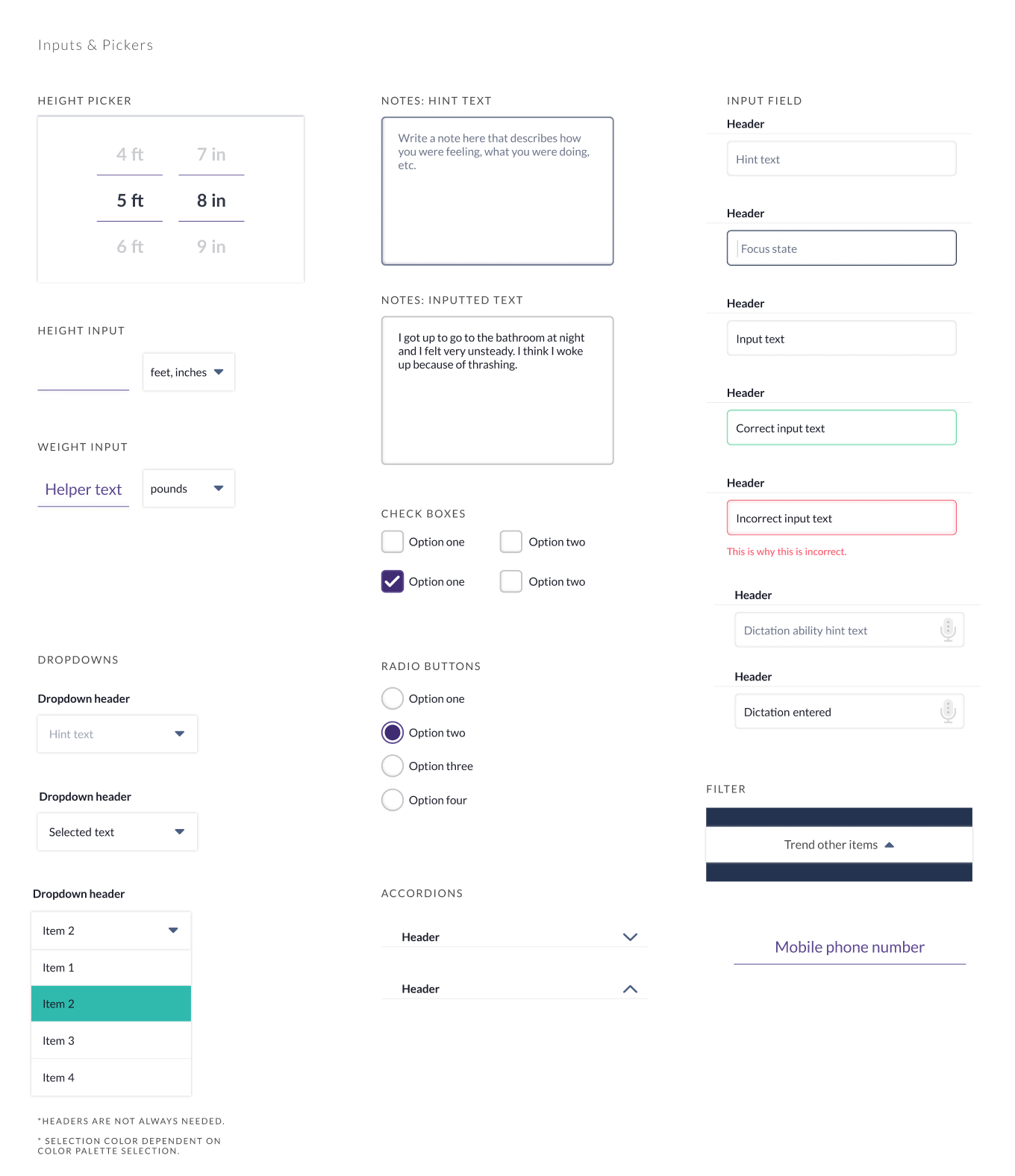
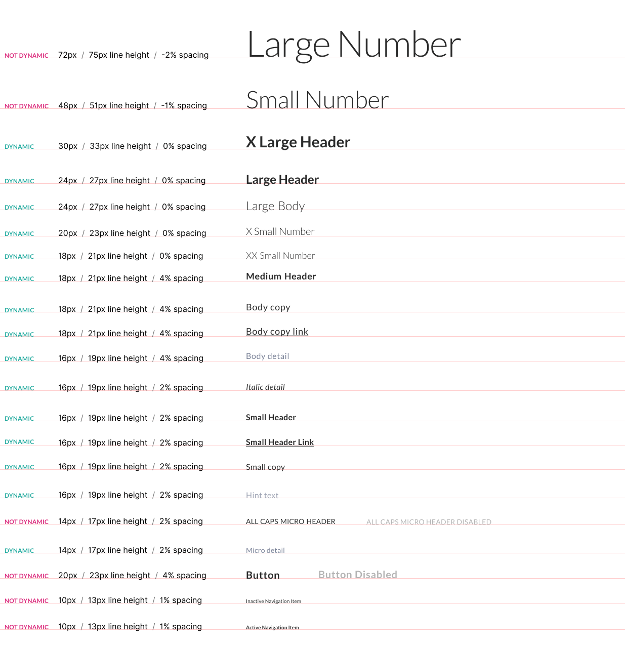
The Design System
A digital health design system was created which would be used in both mPower and in upcoming digital health research studies. The design system had to have a multitude of key elements in order for it to be successful.
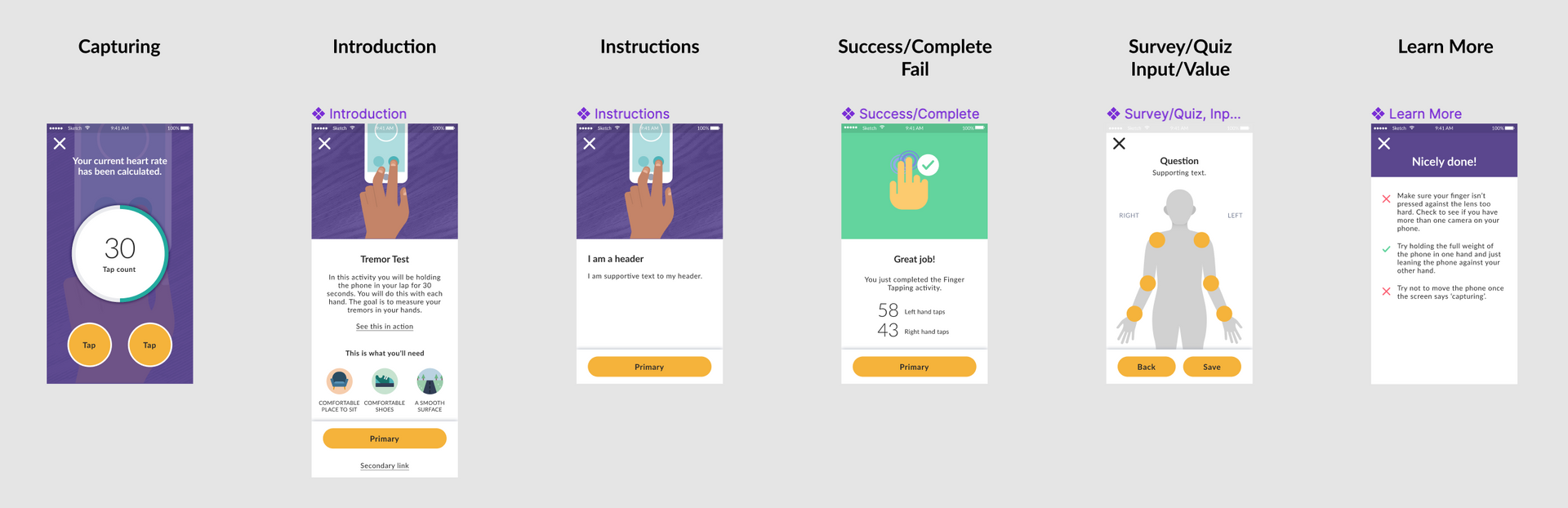
Select the image to view in more detail.
Design System Attributes
Accessible
Accessibility was a must as the system was designed for people with a variety of health conditions. This meant that colors and typography had to meet color blindness guidelines, and touch targets had to be large enough that Parkinson's patients could successfully engage with the app.
Vast
The system was designed to be shared with researchers, universities and organizations that were looking to do their own research studies. Therefore the system had to have a great deal of flexibility when it came to branding.
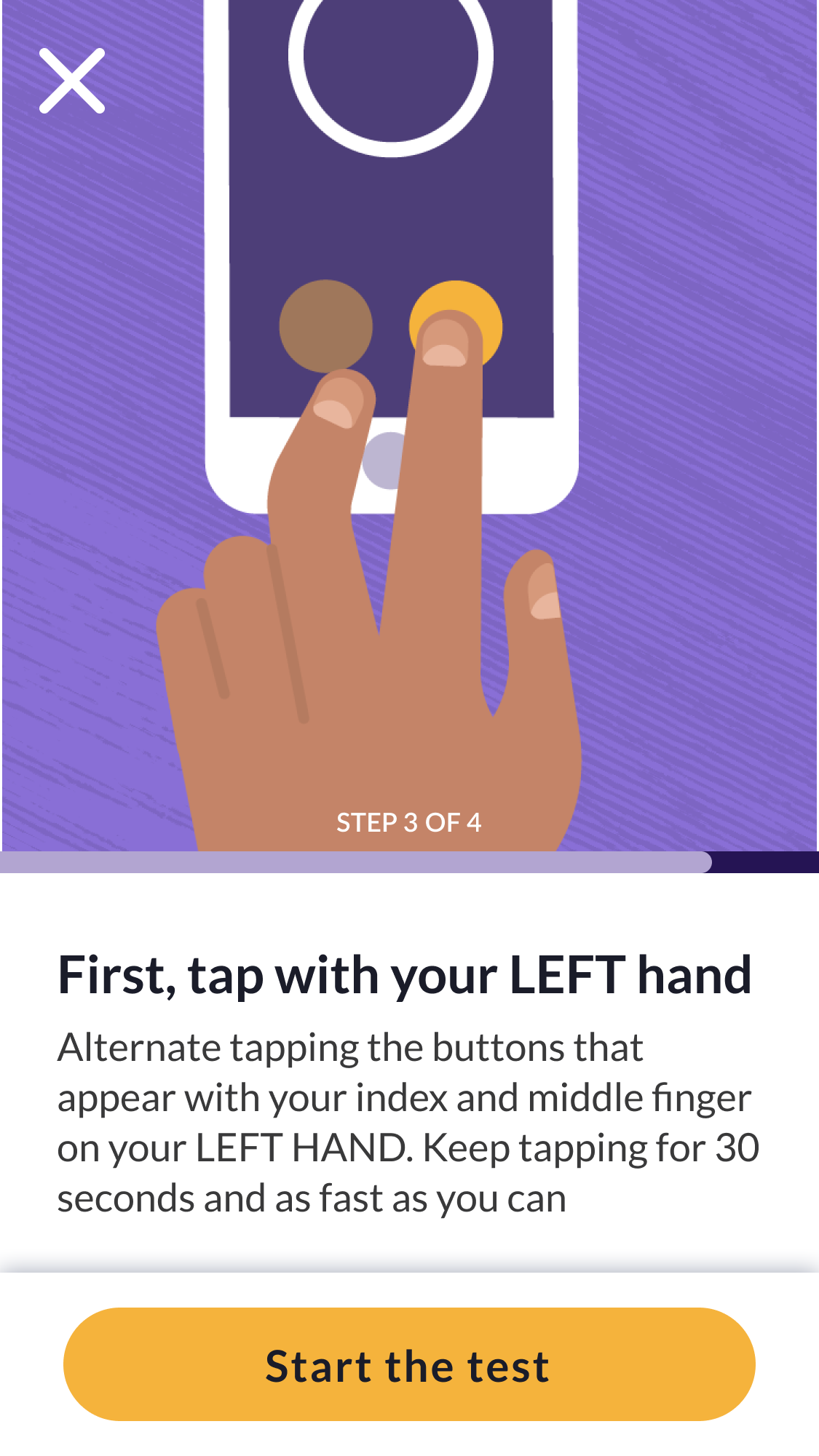
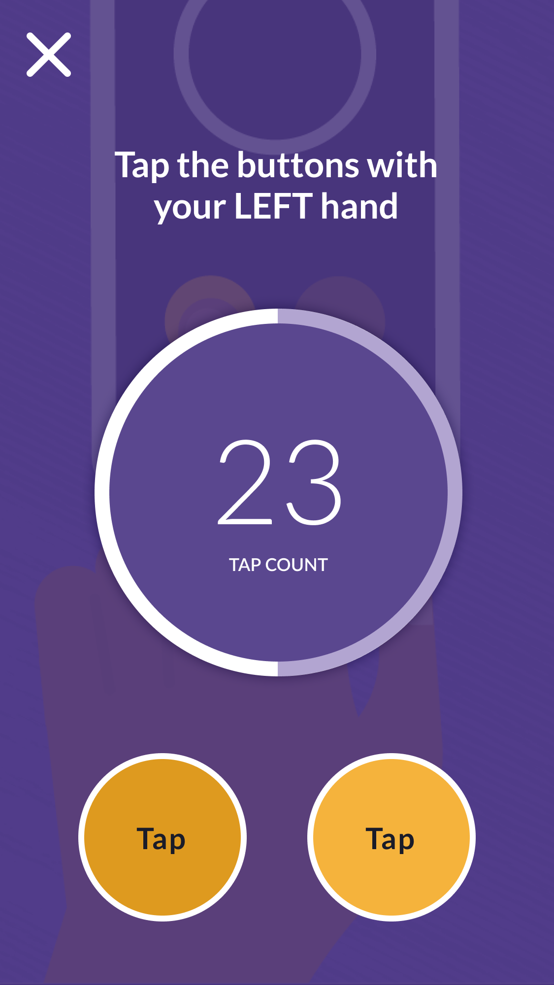
Digital Health Measures
The system also contained digital health measures. This library of measures was redesigned to be more user friendly and engaging. This involved redesigning instructions, updating content, addition of illustrations (with the help of Skinny Ships) and implementing our updated components.