Mobile Toolbox
Enabling researchers to develop digital health studies.
Product Design
Branding
User Research
About
Mobile Toolbox allows researchers to create digital health studies using assessments which were typically only done in person at a clinic.
Participants can now do assessments from well-established measurement systems such as the NIH Toolbox®, Patient Reported Outcomes Measurement Information System®; and International Cognitive Ability Resource® on their mobile device.
The Problem
User research had uncovered some issues with version 1 of Mobile Toolbox. Upon inheriting the project, I was tasked with improving the current design, as well as implementing branding.
Research
Upon completing user research, I uncovered that researchers needed some key features in order for Mobile Toolbox to really be successful within their workflow.
The Findings
Modify participants
Users expressed frustration that they were not able to modify their participants. This led to users having to do unnecessary tasks in order to ensure their participants were registered and up to date within the system.
More details
While there were many details which the users found useful, it was not enough. Users wanted even more detail about their participants.
More user friendly
Users were unable to successfully engage with all elements within the current version. Small adjustments made huge changes in the usability of the product.
Design
There were a wealth of design changes which came out of the heuristic analysis, user testing, usability tests, and workshop sessions. Some of the improvements are seen below.
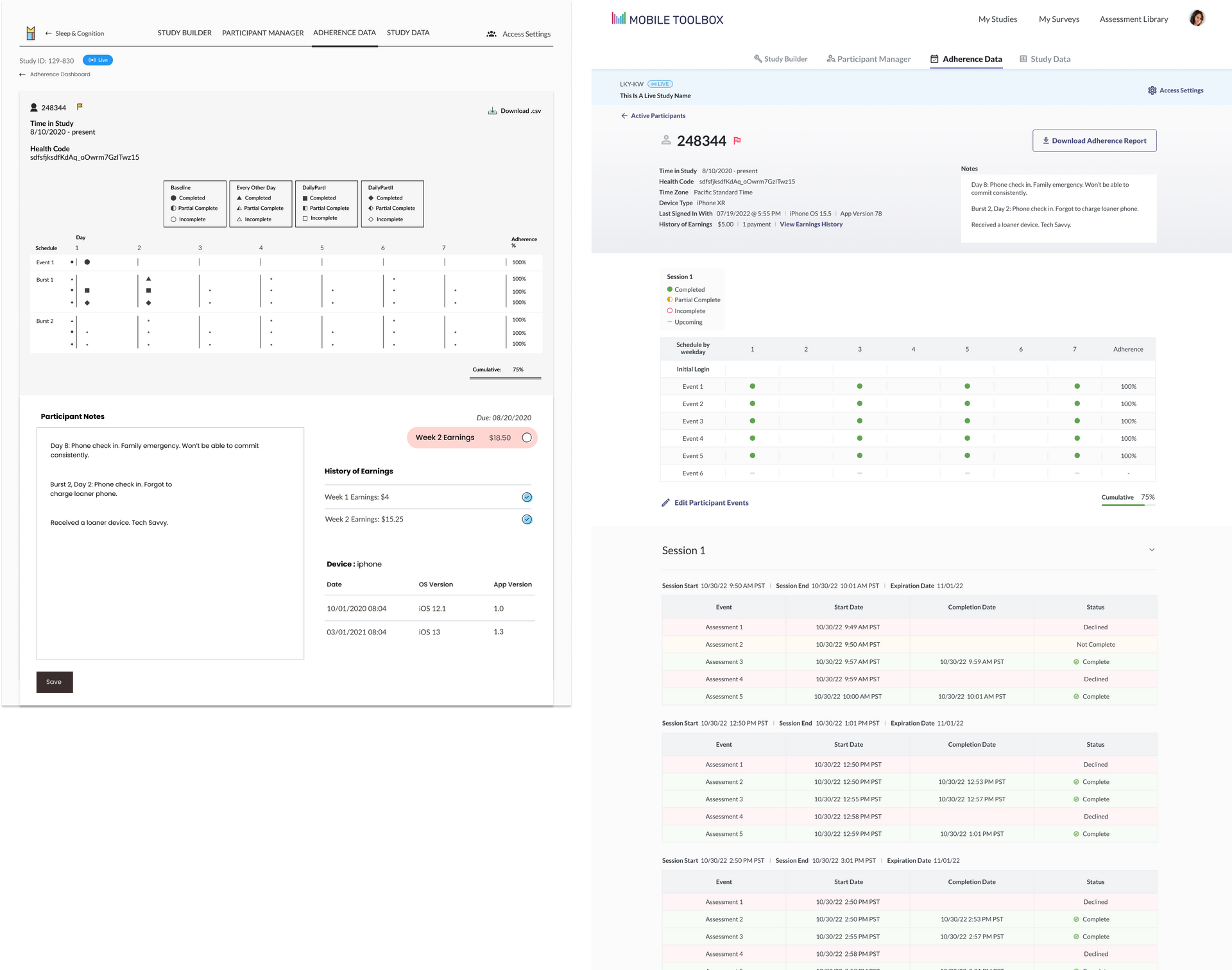
Adherence Data Improvements
User feedback and a heuristic session created a list of improvements to be made for our version 2. Some of which were:
- Participant details and notes were previously scattered throughout the page.
Bringing them together at the top of the page eliminated any confusion researchers had findings these details. - Navigation was a huge pain point to users.
Users were confused about how to navigate to different studies, the newly added Surveys and Assessment Library so the navigation IA was reconfigured to allow for a smoother experience. - Confusion around how to download adherence reports.
Users were making life more complicated by using round about ways to download reports. Bringing this feature front and center streamlined the process. - Project Access Settings
Access settings were at a project level. However in the previous design, their level of hierarchy made it seem as if it was at an account level. Rethinking how this was shown helped to eliminate this confusion. - Schedule
Users were confused about the project schedule. Upcoming events were not clear and completion percentage was often mistaken. Incorporating colors in addition to the shapes and using em dashes with tooltips instead of circles eliminated user errors in determining what was an upcoming event. - Editing Participant Events
Participant details previously could not be edited so adding the ability to edit these events easily from this page was helpful in eliminating extra work for the researchers. - Session Level Information
It was typical for a researcher to have multiple sessions for a participant with the same assessments within each session. Previously a researcher had to download multiple .csv files in order to dig through them and figure out how much of the assessments were complete and how they compared to each other within each session. This was a huge time suck! Allowing users to see all sessions associated with the participant, a quick glimpse into if they were complete/incomplete/declined and how long each assessment took made the process much easier for the researchers and removed the step of needing to download tons of files in order to successfully complete the task.
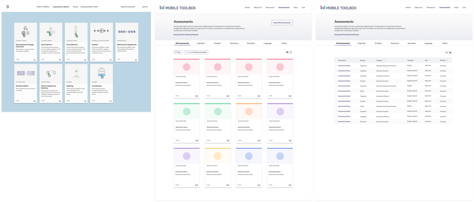
Assessment Library
Our assessment library was looking to grow by hundreds of assessments in the near future and it was clear that the version 1 implementation of the assessment library would not scale well. There was also a lot of confusion around the assessment categories. Icons were currently in a variety of colors, leading to researchers beliefs that they were somehow related.
- Ability to demo assessments
Users wanted the ability to try assessments out before adding them into their studies. - Assessment categories eliminated frustration and increased speed of browsing
With the library looking to grow it was clear categories were needed. Assessment "domains" were given a unique color and users had the ability to filer their assessments quickly as needed. - Filtering
Users wanted to filter the assessments to see which would be most useful for their study. The addition of a filter button and ability to see the most recently added ensured they were always seeing the most valuable assessments for their project. - List and card views
Users wanted multiple view options so list and card views were created and accessible by a toggle. This would come in extremely useful as the library grew as well.
Branding
Product Values
There were a wealth of values which the stakeholders had expressed to us. I took the values into consideration as I began to draw up concepts for the new Mobile Toolbox logo. While the logo hit upon a few of them, the concepts were mostly highlighting:
Assessment/Measurement Focused
Accurate/Valid
Reliable
Remote/Mobile/Home
Self-Administered/Users Own Smartphone
Easy to Use
Data Access and Scoring
Responsive to Change/Trend Data
Secure
Flexible
Low Burden
Brief/Quick Engagement
Decentralized
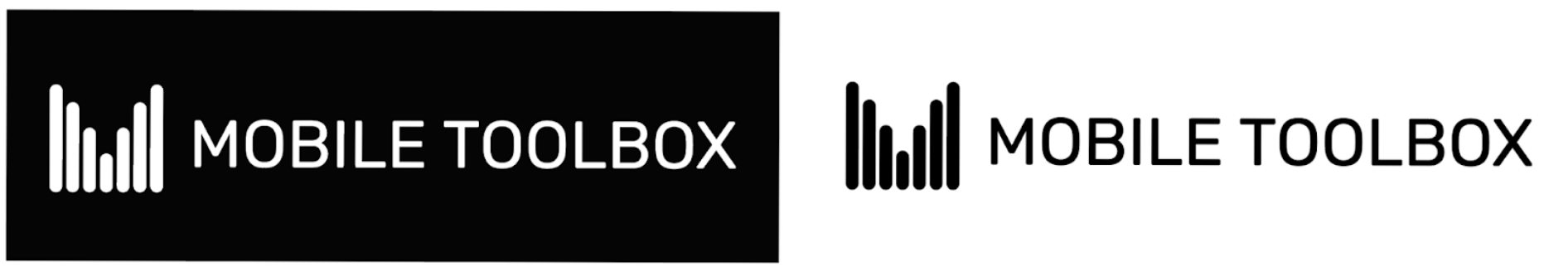
The final logo encompassed a few key elements depending on how the user viewed it that helped to make it successful.
- Incorporated the Mobile Toolbox measurement colors
By incorporating many of the measurement colors, it subliminaly showcased the broad library of assessments Mobile Toolbox had to offer. - Charts, Mobile Device, or M?
The logo mark could be viewed many ways! Was it a chart, something evoking a mobile device for the digital assessments, or an "M" for Mobile Toolbox? - Full Color and Black and White
Since this logo would be used in many different ways it was crucial that it worked well both in full color and black and white. (The sign of a successful logo should typically follow this pattern.)